
BRAND STANDARDS
INTRODUCTION
The AMTA brand aesthetic celebrates the collaborative aspects of the AMTA. It is infused with the characteristics of cooperation and engagement, allowing the organization to rally in the name of excellence.
For any questions regarding the application of the brand, please contact:
AMTA MARKETING & COMMUNICATIONS
marcom@amta.ca
#1 285005 Wrangler Way
Rocky View, Alberta T1X 0K3
CORPORATE LOGO
WORDMARK
The AMTA wordmark is a simple and articulate representation of the organization. The geometric and single stroke letterforms are meant to represent roadways, while the simplified A’s symbolize movement and growth, and the full-colour variant shows momentum and change.
The wordmark may be used on its own when the full name of the organization is shown elsewhere on the materials.
The full-colour wordmark should be used on white backgrounds only. The single-colour and reverse variations are to be used in a way that ensures ample contrast between the wordmark and the background.
In the event that materials must be printed in black and white, the black wordmark should be used. The AMTA wordmark should never be rendered in greyscale.

Full-colour wordmark

Black wordmark

Single-colour wordmark

Reverse-colour wordmark
FULL-NAME SIGNATURE
The full-name signature should be used when the organization name needs to be present, including on identity collateral and websites.
The full-colour signature should only be used on white backgrounds.
The single-colour and reverse variations should be used in a way that ensures ample contrast between the signature and the background.
In the event that materials must be printed in black and white, the black signature should be used. The AMTA full-name signature should never be rendered in greyscale.

Full-colour signature

Black signature

Single-colour signature

Reverse-colour signature
The tagline signature should appear in marketing materials where the organization name needs to be present. It is used as a way of punctuating brand messaging.
The full-colour signature should only be used on white backgrounds.
TAGLINE SIGNATURE

Full-colour signature

Black signature

Single-colour signature

Reverse-colour signature
MEMBERSHIP LOGOS
The AMTA Supplier, Carrier, and Associate Carrier membership logos may be used on websites, signage, vehicles, and other marketing materials only by current AMTA supplier and carrier members. Unauthorized use by non-members is strictly prohibited.

Full-colour Associate Carrier Logo

Full-colour Carrier Logo
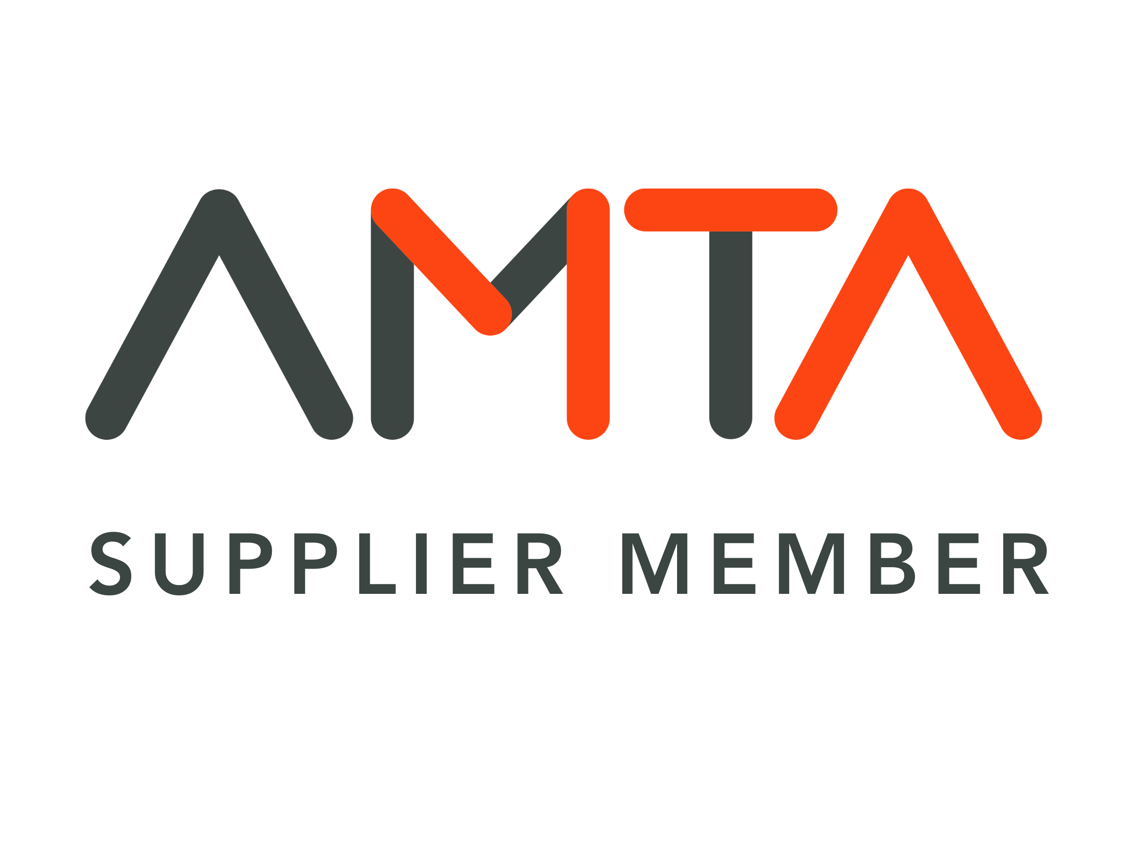
Full-colour Supplier Logo
CLEAR SPACE AGREEMENT
Always maintain the minimum clear space around the AMTA logo. The minimum protective space is X, where X is equal to the height of the AMTA wordmark. This space is required around all sides of the logo – including background edges and trims.
MINIMUM SIZE
Minimum size refers to the smallest at which the logo may be reproduced to ensure its legibility.
COLOURS & PATTERN
COLOUR VALUES
AMTA is represented in two (2) principal colours and four (4) secondary colours. Each of the colours has a corresponding Pantone® value, a four-colour process (CMYK) breakdown, RGB values for digital reproduction and a Hex value specifically for online use. These colours are important to the brand identity system and must never be adjusted.

PATTERN
The AMTA pattern is a graphic element representative of momentum, cooperation and movement. It should be used on communication and branding materials when space permits.
The pattern can be used over solid colours and photography. Available in orange and white, the choice of pattern is up to the user’s discretion, based on contrast and visibility. When using the pattern, it is important to maintain a margin (0.5x) equal to half the space between the arrow elements (x). When splitting colours or photos, the split must occur in the middle of the arrow elements (0.5x).

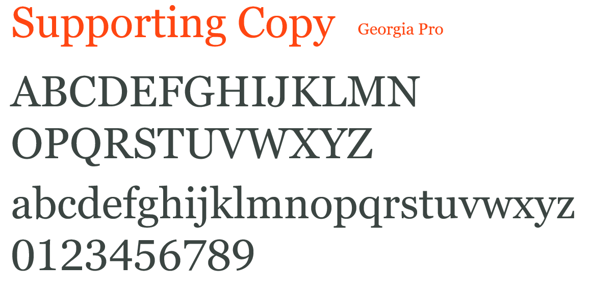
TYPOGRAPHY
TYPE USAGE
The following two (2) typefaces should be used for all AMTA print and web applications. The use of these typefaces will maintain a consistent and cohesive appearance on all materials.
Avenir Next LT Pro Demi should be used for all headlines and sub-headlines.
Georgia Pro should be used for all supporting copy. It is also the standard for web/online applications. Font variants include alternate weights and oblique.

LEGAL
This is a friendly legal reminder that these graphics are proprietary and protected under intellectual property laws.
PLEASE DO NOT
Display these graphics in a way that implies a relationship, affiliation or endorsement by AMTA of your product, service or business without explicit permission from AMTA Marketing & Communications.
Use these graphics as part of your own product, business or service’s name.
Alter these graphics in any way, or combine them with any other graphics, without written consent from AMTA.